Close

UI for Planet Lab

Background

Planet Lab is a gamified social network for K-12 students to learn about science-related subjects and contribute to crowd-sourced science projects. Planet Lab partners with third party contributors — zoos, museums, environmental organizations, and universities — who provide educational content. Planet Lab is also in the process of working with the Chicago Public School system to incorporate its content into the school curriculum.

Case Study Overview (TL;DR)

My team of UI designers worked with the Planet Lab client team to create a visual redesign of the website that would scale across desktop, tablet, and mobile screens. While I collaborated with two other UI designers on the initial research, we each pursued totally different visual directions for the redesign, giving our clients several options to choose from.

Coming to this project with only UX work under my belt so far proved to be extra challenging for me — I constantly had to avoid going off on UX tangents, forcing myself to focus solely on the visual redesign. However, that perspective did confirm the importance of cementing the UX foundation before pivoting to visual. Overall, I learned a ton about the UI iterative process and could see my own progression as I completed each version of the mockups. Being able to see improvement in yourself and show your client team those improvements made the hard work worthwhile. Read all about it below or just scroll through the brightly colored pictures.

I worked on: Competitive analysis • Style Tiles • Hi-fidelity mockups • Style guide

Research and Synthesize

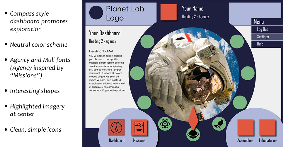
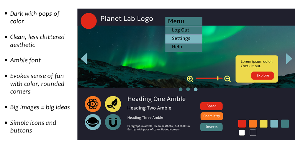
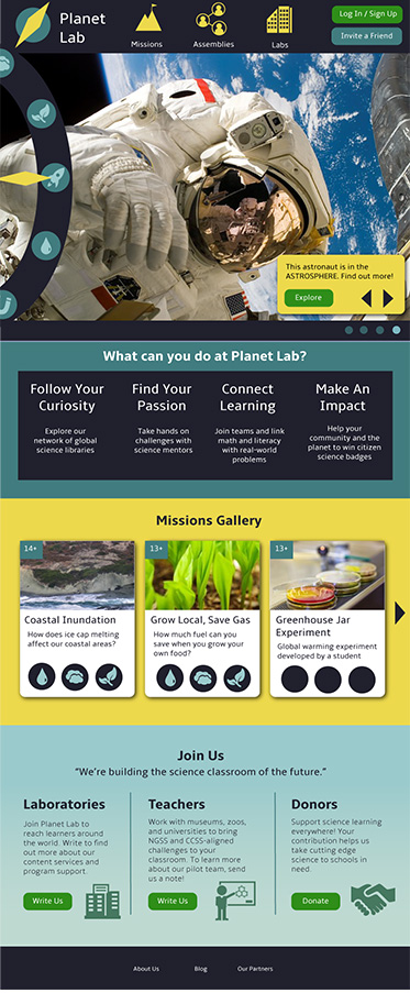
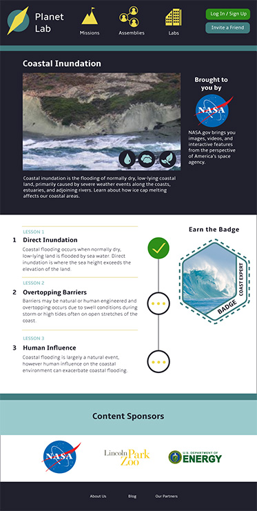
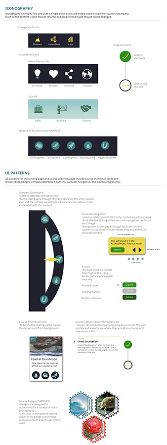
Kick Off and Constraints

We met with the Planet Lab client team to understand their vision and goals for the new visual direction of the site. They provided examples of the previous version of the site and we talked through which elements they wanted to update, discard, or carry forward. I had several questions about the vocabulary used throughout the site (e.g., the meaning of missions, quests, assemblies, laboratories) and the layout of the key pages I'd be redesigning. There were also some specific constraints I'd need to work within — notably, they wanted a design that would appeal to kids, but without alienating adults who would also be visiting the site (such as third party contributors, teachers, or donors). Related, the redesign needed to accommodate a wide range of third party educational content and imagery. Out of these discussions, I captured the client team's main goals:

  • A modular and easily updateable layout to accommodate third party contributors

  • A visual aesthetic that would complement contributor's widely varying content

  • Appeals to both kids and adults

  • Big hero images to illustrate "big ideas" about science

  • Highlight science photography in some way

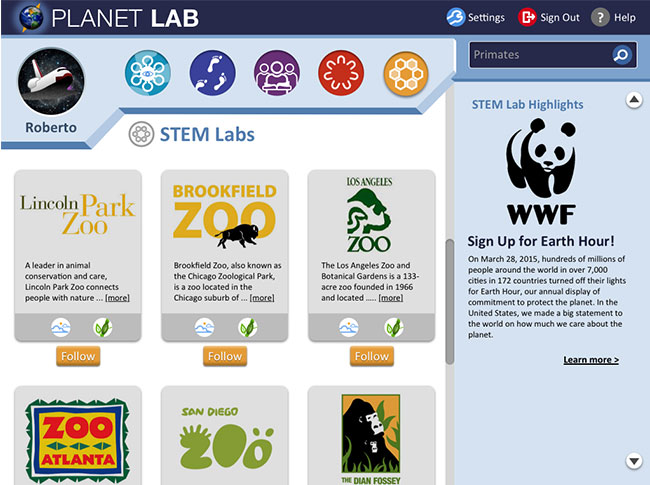
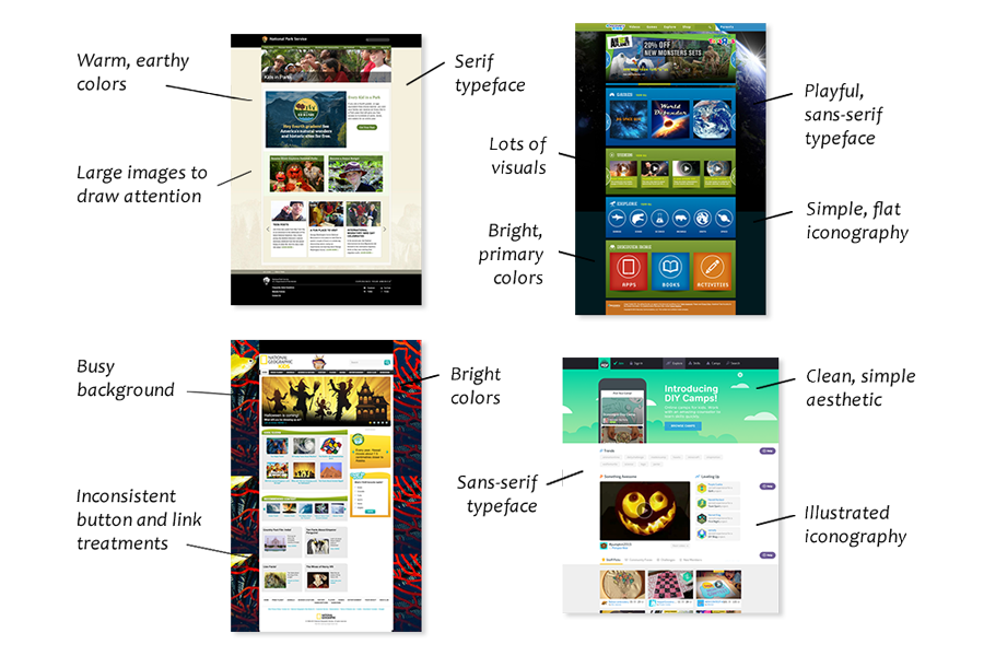
Below are a sampling of pages from the client team's previous site.

Competitive Analysis

To begin, each of us separately started reviewing popular kids websites, looking for patterns and inspiration. I looked at both educational and entertainment sites targeted towards kids. We reunited to share our findings with each other, discuss ideas, and pick out the broader trends to later share with the client team. Some of the trends and characteristics we found during our exploration:

  • Color palettes tended towards the very colorful, typically using bright, primary colors or alternatively, earthy, warm colors

  • Little use of whitespace — many sites were visually cluttered

  • Typography favored sans-serif fonts

  • Imagery typically consisted of stock photography, and/or heavily illustrated elements

  • Interactivity was a large component of many sites

Competitive Analysis

Design and Test

Style Tiles

Keeping the client team's needs and wants in mind, as well as mining the competitor analysis for both examples of inspiration and also 'what not to do', I created two different style tiles.

Style Tile 1 Style Tile 2

Hi-fidelity Mockups (Iteration 1)

After sharing and getting feedback on the style tiles from the client team, I combined the best elements from each style tile into a single, cohesive look. I stuck with a version of the compass-style dashboard from the first style tile, then applied the color palette and styling from the second, made a few more edits, and voilà — "the whole is greater than the sum of its parts"! Using the new, unified look, I designed my first hi-fidelity mockup of Planet Lab's landing page.

And although we almost hit a roadblock when we discovered there were no wireframes to work from, fortunately the client team gallantly stepped in. They quickly drafted and walked us through some wireframe sketches they created on the fly and we were able to continue the redesign without losing any time.

Landing Page Mockup version 1

Hi-fidelity Mockups (Iteration 2)

After another round of review with the client team, I made several updates — giving the landing page a lighter, brighter feel; changing the button color from red to green (seen on the astronaut mockup); and cleaning up the iconography. I also inserted different sample hero images into my design to show how the layout and color palette would complement varying imagery.

My next mockup was the course overview page, where I also explored using different science photography as part of the badges (students earn different badges for completing lessons).

  • I kept this page a bit lighter and cleaner than the landing page — to keep the focus on lessons

  • For the Content Sponsors section, I used a white background to address various logo styles, sizes, and colors

  • I created a badge style that would easily incorporate interchangeable science photography

Course Overview Mockup version 1 Badges

Hi-fidelity Mockups and Style Guide (Iteration 3)

I made a few more adjustments to the final versions of the landing page and course overview page, then translated the design to tablet and mobile layouts.

  • Added space between sections to let the pages breathe

  • Lightened up the light blue section using a gradient and changed the "What can you do at Planet Lab?" section to white

  • Cleaned up iconography — flat, simple, and one color

Finally, I created a comprehensive style guide for my redesign, covering logo usage, typography, color palette, image use, iconography, and UI patterns.

Style Guide Style Guide

Outcomes

Results

Our team of UI designers each received positive feedback on our redesigns from the client team. For their final decision, the client team largely used my redesign for the landing page, while also incorporating elements from the other UI designers. I was delighted that my design ended up being used on the landing page. Planet Lab is still currently under construction with plans to launch in beta with select Chicago Public Schools over the 2015-2016 school year.

I learned a ton about the UI process during this project and I was able to watch my skills progress through each iteration — from style tiles to final mockups, as shown below.

Iterations

And the grand finale — below are drafts of the final landing page and course overview pages that the client team created using our redesign work:

Final Thoughts

Let me drop some knowledge about what I learned during this project:

  • Make sure you have everything you need from your client before you start, (cough-cough-wireframes!), don't assume they exist

  • Push for feedback — some people might feel uncomfortable giving it, but you need it to move your design forward

  • Set clear deliverables for yourself — having come to this project from a UX perspective, I found myself constantly going down UX rabbit holes when I needed to focus on the visual design

  • While working on the UI side was enlightening, my heart still belongs to UX

Back to Projects